Unable to Submit Form: Please Try Again

If there’s one thing we could skip when looking to purchase or download something online, it’s the dreaded form. Not only do we have to fill out the numerous and repetitive fields, but sometimes, even minor errors will prevent us from being able to submit it. And it is not always clear where the error is, why it’s an error, or how to correct it.

Unfortunately, we can’t bypass these forms since they’re an essential component of the online conversion process, whether it’s for sales (checkout form), contact (contact form) or registration (registration form).
In my previous post I mentioned that forms should have the least fields possible and that this would help to decrease drop out caused by visitors being overwhelmed by long forms. We also showed that the perception of task difficulty is affected not only by its actual complexity, but also by its appearance. In other words, if a form looks complex, it’s just as bad as if it really is complex!
PRE-EMPT & MINIMIZE CUSTOMER FRUSTRATION
Today I will discuss another major cause of form abandonment – customer frustration. The number one cause of frustration in the online form process is getting errors. The error itself does not lead to frustration. It’s the feeling of helplessness that takes over when the visitor doesn’t know what they’ve done wrong. So it’s really important to keep the form submission error rate as low as possible. And if errors are present, to make them as easy as possible to correct.
We’ve all been in the situation of filling in a form and then for some reason, not being able to submit. Sometimes the error can be undetected, (perhaps it’s somewhere at the top of the page), leading you to click the call-to-action button at the bottom of the page 2, 3 or maybe even 10 times (depending on your frustration!). Or, when actually presented with the erroneous field, we fail to understand what the actual error is (“error, please correct”)!
In order to reduce customer frustration and drop-out rate as much as possible and deliver a better overall experience, there are a number of ways to prevent errors and to make them more painless to correct:
1 – Prevention is better than cure. Provide tips and examples alongside each form field (such as the correct format for zip codes and date) to guide your visitors.
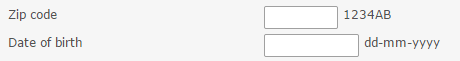
This will prevent them from having to guess and saves them from having to return to the same field after they’ve already clicked ‘submit’.
2 – In-line validation. Like the above, this type of validation also saves the customer from hitting submit and then having to return to re-do specific fields. In-line validation will show if each field was filled correctly or if there is an error, enabling you to correct it before you progress further down the page.
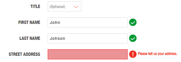
Provide both positive and negative in-line validation
This is the opposite of ‘on-page’ validation that only shows you the errors after having clicked the submit button.
![]() Contentsquare form analytics shows which fields are left blank, or which are mostly refilled.
Contentsquare form analytics shows which fields are left blank, or which are mostly refilled.
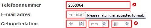
3 – Be explicit in your error message. Being clear goes a long way to preventing frustration and helping the visitor to correct the field input.
For example, the error message “Match the requested format” is not clear, since there is no description of the correct format of a phone number.
and an example for a good error description which makes it easy for the visitor to understand what is really required
4 – When there are errors after form submit, take the visitor back to the top of the page and describe all errors.
This will directly expose the visitor to the errors in the form (and save them from endlessly trying to click the call-to-action at the bottom of the page). This way the visitor doesn’t have to look for the erroneous field and will be less likely to get frustrated. Just make sure to describe all the form submission errors that are present on the page (and not as in the example, only describing one).
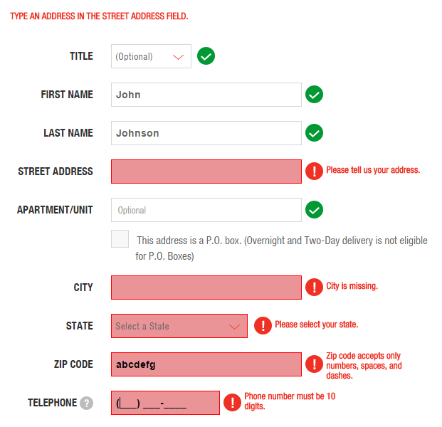
Form does not mention all errors in the error summary
CONCLUSION – PUT YOURSELF IN YOUR CUSTOMERS’ SHOES
The main takeaway is to make it as easy as possible for your visitors to fill the form correctly the first time around, and if they have to make corrections, to help them make them on the spot, while they’re focused on the field in question. The thing to avoid is falsely raising customers’ hopes by allowing them to reach the end of the form and click submit, only to dash their hopes by forcing them to start over again – and worse, by not showing them where they went wrong! Think about your own experiences with forms and about your own frustrations when you were not able to submit.
These recommendations can have a huge impact on your website’s conversion rate, because in the end: a satisfied customer is a returning customer.

Clicktale was acquired by Contentsquare in 2019. Since then, tools and features mentioned in this blog may have evolved. Learn more about our Digital Experience Analytics Platform.